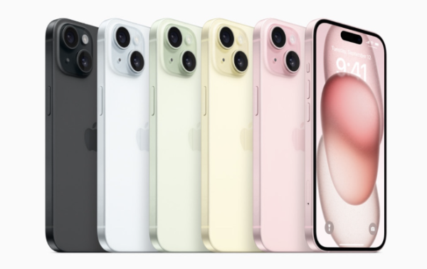
Sleek edges. Classy colors. Smooth finishes. Simple functions. Sophisticated displays. One iconic logo. Throughout these past few decades, Apple has created an aesthetic of their own through their phenomenal line of products. The visual captivation that Apple enforces into their gadgets has attracted millions of people all over the world. This further explanation as to how Apple has been able to foster loyalty among consumers, who stay committed to the company by keeping up product after product. For example, the iPhone, one of Apple’s most recognizable innovations, has stood towering over all the other smartphones released by competing technology companies. Its natural evolution into the default choice for smartphones serves to prove Apple’s prominent one-of-a-kind influence in shaping consumer preferences.
The core philosophy of Apple’s design revolves around these three principles: minimalism, elegance, and functionality. Apple implements these principles into every facet of their products, reflecting their commitment to creating technology that advances in visual appeal as much as functional performance.

Apple’s emphasis on minimalism is evident in their practice of keeping their products refined with only their essential elements. They ensure the absence of unnecessary additions and features by maintaining uncluttered visuals, which leave only what is crucial for the product’s performance. The clarity and simplicity allow users to focus on the core functionality without distractions. This also extends to the physical design of Apple products, which most often feature neat silhouettes and only the most vital details.
Apple also achieves elegance through their meticulous attention to user experience. The choice of materials, such as aluminum and glass, allows Apple products to exhibit a sense of luxury for users. Not to mention the sophisticated range of colors offered for nearly all Apple products, allowing more room for personal expression and individual style among users. Even the packaging is carefully designed, making an Apple product’s unboxing an experience of its own. We even end up holding onto those iPhone boxes, am I right?

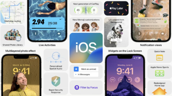
Apple’s approach towards functionality is that every feature and component of a product should serve a clear and useful purpose. Apple designs with the user’s needs in mind, prioritizing seamless integration into everyday life. Particularly, Apple’s implementations of smooth transitions and easily navigable options enhance the user experience by simplifying interactions between the user and their device.
So now what is there to do other than to wait for the new iPhone once more?


